Almost everyone arrives with a colour already in mind. Something blue for the hall. Something warm for the room with the grey sofa. Choosing a painting by colour is a sensible place to start, and it goes wrong for a reason nobody mentions: two pictures can hold the same colour and behave nothing alike on a wall, because one of them gives that colour four fifths of its surface and the other gives it a twentieth.
So we measured it instead of describing it. What follows is what the catalogue actually contains, in numbers, and what those numbers do once a piece is hanging in a room.
What we measured, and what we did not
We took the photograph from every artwork page, cropped away the white studio margin, and sorted every remaining pixel into plain colour families: red, rust, brown, yellow, green, turquoise, blue, violet, pink, plus white, grey and black. Forty-eight of the sixty-one works are pictures and are counted here. The thirteen objects — the painted furniture, the wine glasses, the tissue box — stand on a studio backdrop that no crop can remove from around a three-dimensional shape, so they are left out of every figure below.
Two limits worth stating plainly. This measures photographs, not paint: a photograph is one lens, one set of lights, one afternoon. And “neutral” here means white, grey or black, which means the heavy black lines running across several of these works count as neutral even though they are the first thing you see.
One colour can hold nearly the whole surface
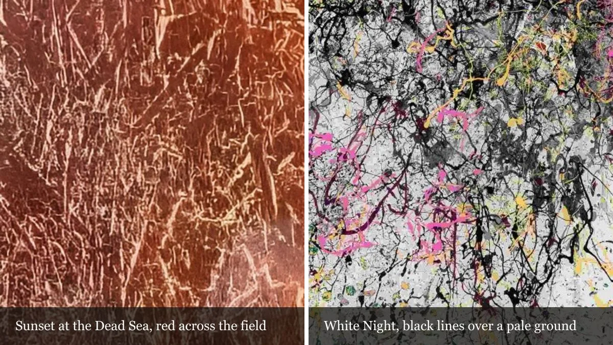
Six of the forty-eight give a single colour family at least 40% of the entire picture. Three go much further than that: in those, one colour accounts for three quarters or more of all the colour present, and there is almost no neutral ground anywhere for the eye to rest on.
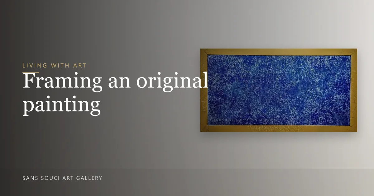
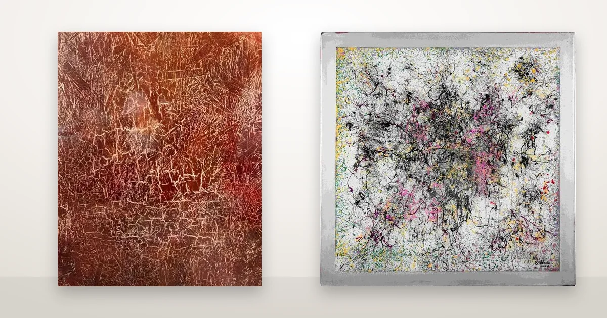
Sunset at the Dead Sea is the clearest case in the catalogue. Red covers about 85% of its photograph, rust and brown take everything that is left, and white, grey and black together measure zero. There is no pale passage in it at all. The artist’s note on the page describes the landscape near Masada, where “the surrounding landscape is filled with wine-red colors until it is utterly inebriated with crimson” — the sentence and the measurement are describing the same thing. Morgenwald in Meißen is the same case in blue at about 95%, and Morning Forest in Meißen at about 75%.
A work built this way behaves less like a picture on a wall and more like a lit panel of colour. It sets the temperature of the wall it hangs on and, in a small room, of the wall opposite it as well. Sunset at the Dead Sea is four feet square, natural dye and acrylic under a resin coat on wood, so the question it puts to you is not whether it goes with the sofa. It is whether you are willing to let one object decide the room. Anything else on that wall becomes a neighbour.
Or it can be spread so thin the wall reads pale
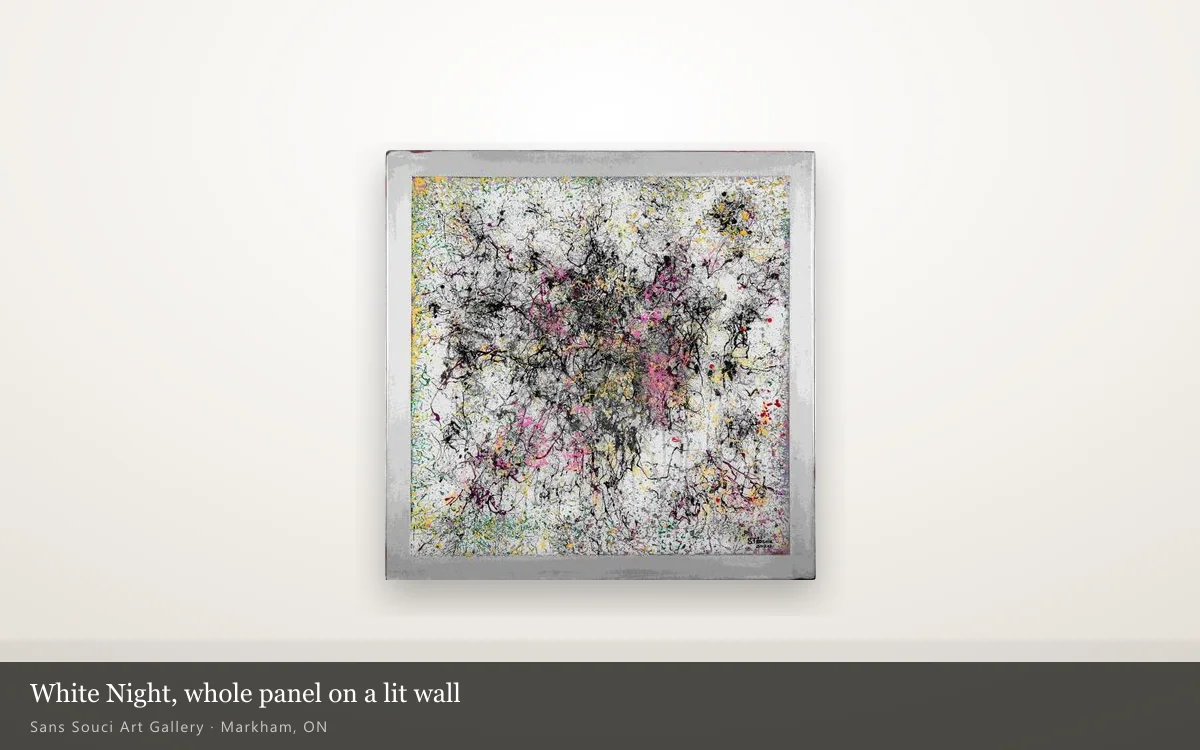
White Night sits at the far end of the other direction, and it is the most extreme work in the catalogue. About four fifths of its photograph measures as white, grey or black. The colour that remains — under a fifth of the surface — is divided between pink, green, yellow, brown and red, and the largest of those holds only a quarter of that fifth. Nothing in the picture reaches five per cent.
Close up it is not a pale painting at all. It is a light ground under a dense net of black lines, with flecks of magenta, yellow, green, red and violet scattered right across the field, and a signature in the bottom corner. The note on its page reads: “Have you ever experienced White Nights when you could see all colors of early summer in its beauty? I have!” The note and the numbers are not in conflict. They answer different questions. The note says what is in the picture; the measurement says how much surface each of those colours was given — and that is what decides what you see from the doorway.
| Measured on the catalogue photograph | Sunset at the Dead Sea | White Night | The median picture here |
|---|---|---|---|
| Size | 4ft x 4ft | 24 x 24 in (61 x 61 cm) | — |
| Materials as stated on the page | Natural dye, acrylic, resin on wood | Acrylic, resin on fiberboard | — |
| Largest colour family | red | pink | — |
| Its share of the whole picture | 85% | 4.6% | 19.6% |
| White, grey and black together | 0% | 82% | 42% |
| Colour families holding a tenth or more of the colour present | 1 | 4 | 3 |
| What it does from across a room | reads as one colour | reads as light and quiet | reads as a surface, not a colour |
| Status at the time of writing | Available | Available | — |
What the catalogue holds, counted
Across the forty-eight pictures:
- Six give one colour family 40% or more of the whole picture. Every one of them was available when this was written: the two Meißen works, Sunset at the Dead Sea, Whisper, Traces of the Forgotten and Autumn Hysteria.
- Sixteen are half white, grey and black or more — light or dark grounds with the colour worked into them rather than across them.
- Twenty-five have no colour family reaching 20% of the picture. These are the works that do not resolve from the far side of a room; they need you to walk up to them.
- Seventeen carry four or more colour families each holding at least a tenth of the colour present. The busiest is Fluently Python, with six.
- The leading colour, picture by picture: brown on 14, blue on 10, red on 9, turquoise on 6, rust on 4, green on 4, pink on 1.
- The middle of the catalogue is quieter than people expect. In the median picture the largest colour family holds under 20% of the surface, and 42% of it measures neutral.
That last line is the practical one. If you want a piece that reads as a colour from the doorway, the shortlist is genuinely short — six out of forty-eight. If you want a wall that stays calm and rewards standing close to it, most of this catalogue is already that, and the question becomes which colours you want to find when you get there.
Where to stop trusting the photograph
Every number above can be undone by the wall you hang the work on. The lamp above it has a colour temperature, and the Canadian Conservation Institute’s note on light gives the ranges: below 3000 K is warm light and above 4000 K is cool, ordinary incandescent bulbs sit at 2700–2800 K, “cool white” fluorescent tubes at about 4200 K, daylight lamps between 5000 and 6500 K. A rust-heavy surface under a 2700 K bulb and the same surface under a 5000 K one are not the same colour to your eye. The same note lists the colour rendering index, where 90–100 is excellent and 80–89 good — a low-CRI lamp will flatten exactly the small scattered colours that make a work like White Night worth walking up to.
Then there is the finish. Thirty-five of these forty-eight pictures name a resin, epoxy or varnish coat on their materials line, and a poured coat cures to a hard reflective face. That face returns your room to you: a green wall opposite, a warm lamp behind your shoulder, a window at four in the afternoon. We wrote about that swing in why the same painting looks different at 9am and 6pm, and about which colour ends up carrying a room in living with blue, rust and gold.
So use these numbers the way you would use a floor plan: to shorten a list, not to make the decision. Browse the full catalogue of originals with the question “how much of this is one colour” rather than “is this blue”, and you will pick better from a screen. Then come and stand in front of the two or three that survive. If you cannot get to Markham, write to us and we will photograph a piece for you in daylight, or send a short video of it under a raking light, which is the closest thing to standing there.