Most people choose a painting and then accept whatever wall it lands on. The wall colour gets decided years earlier, for the sofa or the floor. Yet once the work is hung, that wall surrounds it on all four sides, and it changes how light or dark the painting looks before anyone has noticed a single brushstroke. This note is about that wall: its colour, its sheen, and how to test it before you paint anything.
Does the wall colour change how a painting looks?
Yes. The eye does not judge how light a surface is on its own; it judges it against what surrounds it. The same grey reads lighter on a dark ground and darker on a pale one. A painting on a wall is exactly that situation: a field of colour inside a larger field of colour, and the larger field sets the scale.
This is one of the oldest observations in the study of vision. The encyclopaedia entry on the contrast effect traces it back through Goethe, who wrote in 1810 that a grey image on black looks much brighter than the same image on white, and Johannes Müller, who noted in 1838 that a grey strip on a strongly coloured field takes on a faint tint of the opposite colour. The same entry records something that matters for a room: the size of the surrounding field changes the effect. A wall is the largest surrounding field a painting will ever have.
What conservators say about white walls
They question them. The Canadian Conservation Institute, in its long note on light as an agent of deterioration, lists background contrast as something to avoid. It says objects generally look brighter, and less damaged, on a dark matte surface than on a bright glossy one, and it suggests trying it rather than taking its word.
It then goes further and says the museum tradition of white surfaces everywhere, treated as somehow neutral, needs to be re-examined. The test it proposes is simple: when a room has “nice bright” walls, ask whether the collection itself looks bright, “or just the space.”
Two things are worth keeping straight. CCI is writing for museums, and much of what it has in mind is old and faded. The perception part carries over to a house unchanged; the rest of the note, about lux levels and fading, is a separate subject, and we covered it in what direct sun actually costs. And “dark matte” is a direction, not a prescription. Nobody is suggesting a black living room. A mid-tone, flat-finish wall is already a long way from bright white gloss.
Two paintings, the same size, opposite answers
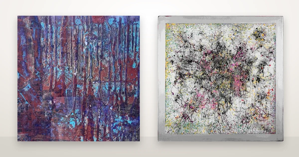
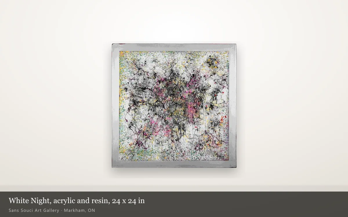
The clearest way to see this is with two works that differ in only one respect. Over The Horizon and White Night are both 24 × 24 in, both on fibreboard, both sealed under a poured clear coat, and both completed in 2020. What separates them is value: how light or dark the whole surface is.
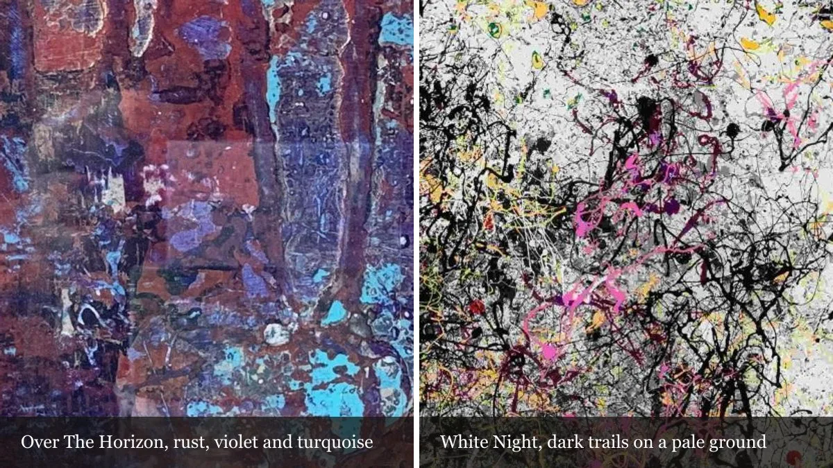
We measured that rather than describing it. Turn each catalogue photograph to greyscale and average it, on a scale from 0 for black to 255 for white: Over The Horizon comes out at 99, White Night at 167. Over The Horizon is a dark field of rust and violet with vertical runs of turquoise, and its materials line names texture and a metallic element under the epoxy. White Night is a pale ground covered in trailed black, pink and yellow line, and in the photograph a plain pale band runs round all four sides.
| Over The Horizon | White Night | |
|---|---|---|
| Size | 24 × 24 in | 24 × 24 in |
| Materials, as its page lists them | fiberboard, acrylic, texture, metallic, sealed with epoxy | acrylic, resin on fiberboard |
| Average value of the photograph (0–255) | 99, dark | 167, pale |
| Against a bright white wall | the edge is the strongest contrast in view; the square reads darker than it is | the pale ground sits close to the wall, the outer band softens, and the dark tangle leads |
| Against a mid-tone matte wall | the outline quietens, and the turquoise runs and pale highlights take the eye | the ground reads whiter and the square separates clearly from the wall |
Neither result is right or wrong. On a white wall, White Night reads as a web of dark line; on a deeper wall, it reads as light. The artist’s own note on its page points at the second reading: “Have you ever experienced White Nights when you could see all colors of early summer in its beauty? I have!” If that is the reading you want, a deeper wall is what brings it out.
Over The Horizon runs the other way. A white wall turns it into a strong dark shape, which can be exactly what a pale room needs. A deeper wall gives up that graphic edge and hands the attention to what is inside the square. Which you want depends on how pale the room already is.
Sheen matters as much as colour
Colour sets what the painting is compared against. Sheen, on the wall and on the painting, decides what gets reflected into it. Of the 48 wall works in this catalogue, 35 carry a poured resin or epoxy coat, and our own page for each of them describes that coat as a reflective face that behaves like glazing without the glass.
That makes CCI’s advice on glazed pictures directly relevant. It says reflections from glass are hard to predict from drawings and should be tested before anything is fixed. Its method works in a house: stretch clear plastic wrap over a wooden frame, hold it where the painting will hang, put lamps where the lights will be, stand where a viewer will stand, and look for reflections. Some reflection from overhead light is unavoidable; the aim is to move it below eye level. What shows up in a gloss face is whatever is bright and opposite it — a window, a lamp, or a pale wall across the room.
How to test a wall before you paint it
Test at full size, in the room, at the hours you use it. A paint chip held against a photograph on a phone tells you almost nothing, because both the surround and the scale are wrong. The sequence below takes an afternoon and costs a sample pot.
- Paint a large card, not a swatch. Make it bigger than the painting by at least a hand’s width on every side. The size of the surround changes the effect, so a small chip underestimates it.
- Look at it when you actually use the room. A wall colour can shift noticeably between daylight and evening lamps, and the painting shifts with it. We went through why in why the same painting looks different at 9am and 6pm.
- Ask which part of the work should lead. The edge, the lightest passage or the darkest line: whichever you want to see first, choose the wall that contrasts least with everything else.
- Prefer a flat finish behind the work. CCI’s comparison is dark matte against bright gloss; the matte half of that is the easy part to follow in any colour.
- Run the plastic-wrap test for a resin face. Stand where you will stand, with the lights you will use, and move the lamp or the painting until the reflection drops below eye level.
One limit to all of this: the wall changes how a painting looks, not how it ages. What ages a surface is the light that falls on it, and that is a question of where the wall is, not what colour it is — see where to hang a textured piece for the placement side.
Bring the wall with you
If you are deciding between works in the main collection, the most useful thing to bring to a viewing is the wall: a photograph of it in daylight and a paint chip, or better, the painted card. Seeing a piece beside the colour it will actually live against answers more than any description on a page. Viewings are by appointment at the gallery in Markham; write to us or call to arrange one, or to ask about either painting here.