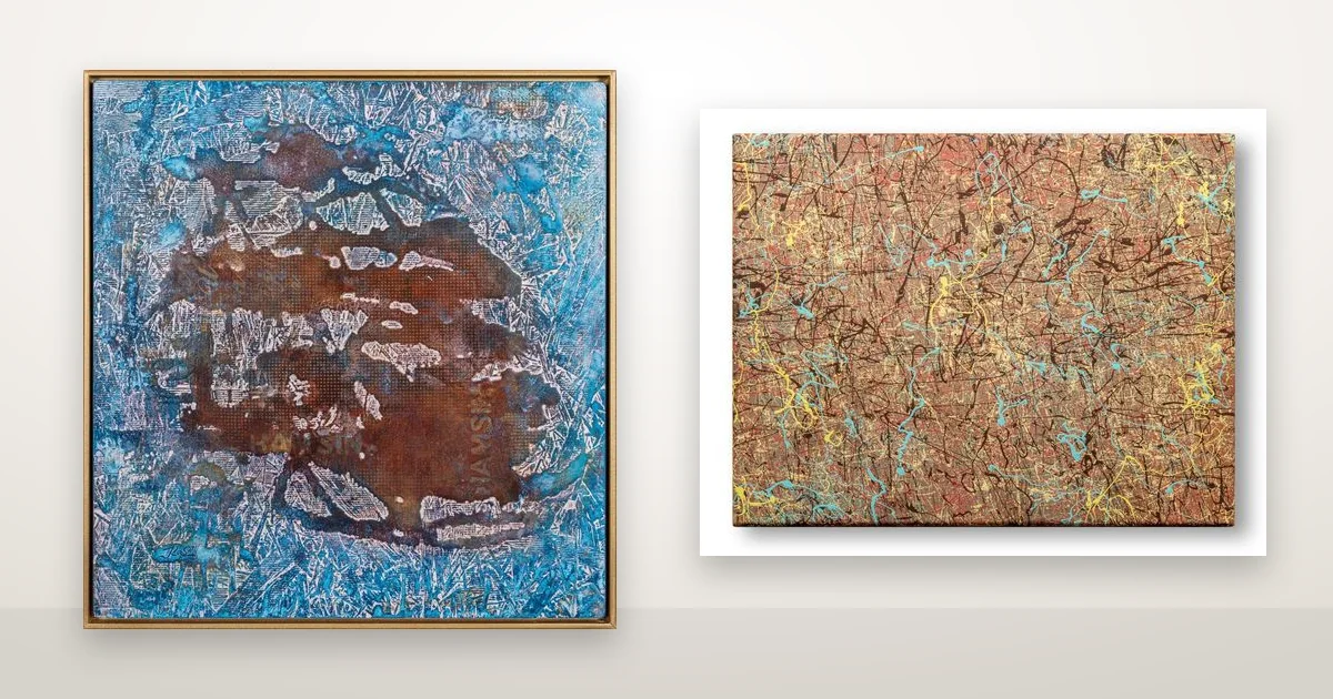
Two paintings in the gallery contain the same three colours — blue, rust and a warm gold — and nobody who sees them together takes them for a pair. Choosing colour in a room turns on that difference. Not which colours a painting contains, but which one holds the field and which one only appears.
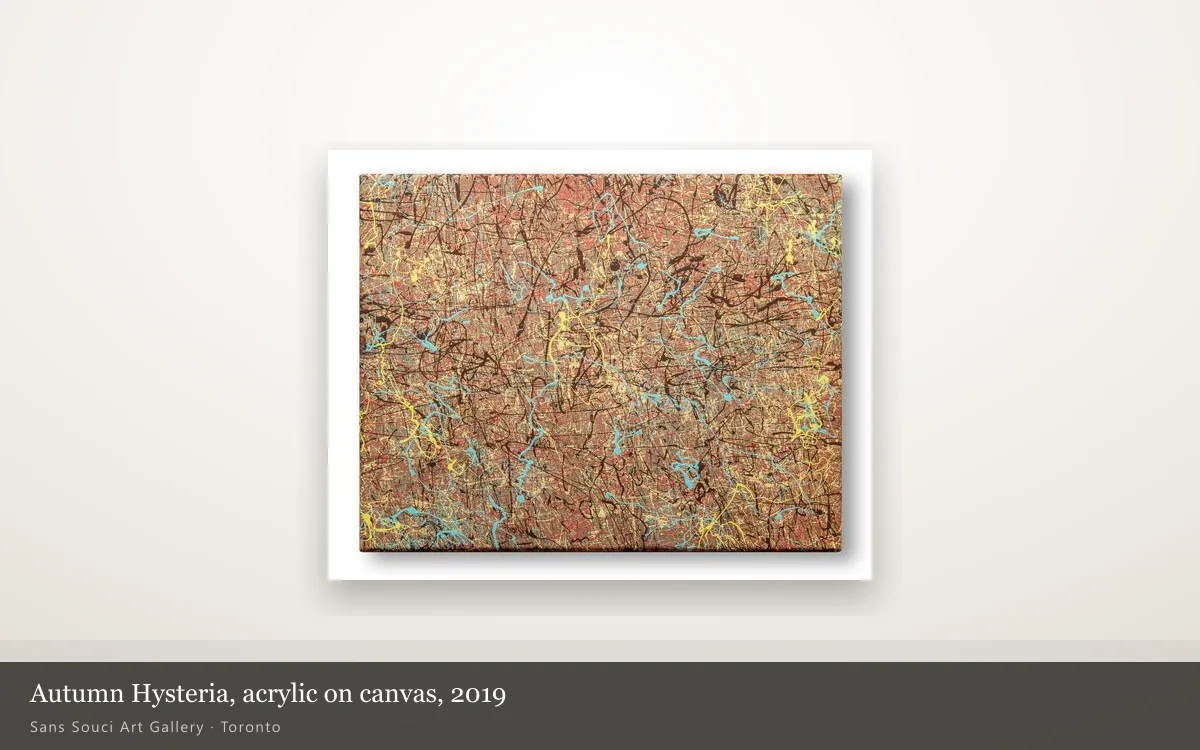
In Hamsin (2022) the blue covers almost the whole board and the rust sits inside it as one irregular mass with soft edges. In Autumn Hysteria the proportions are reversed: rust runs edge to edge, and the blue survives as a scatter of turquoise flicks. Same three notes, two paintings that need different walls.
Does a painting have to match the colours in the room?
No. A painting has to agree with two things only: the light the room actually gets, and the two or three largest colour areas already in it — floor, sofa, wall. Matching a cushion or a vase is how people end up with a piece they have stopped seeing within a month.
The largest areas matter because they are what your eye averages before it ever reaches the painting. A room with a warm oak floor and cream walls is already a rust-and-gold room, and a blue-dominant painting in it becomes the one cool thing in the space. Put the same painting on a grey-blue wall and it stops registering at all.
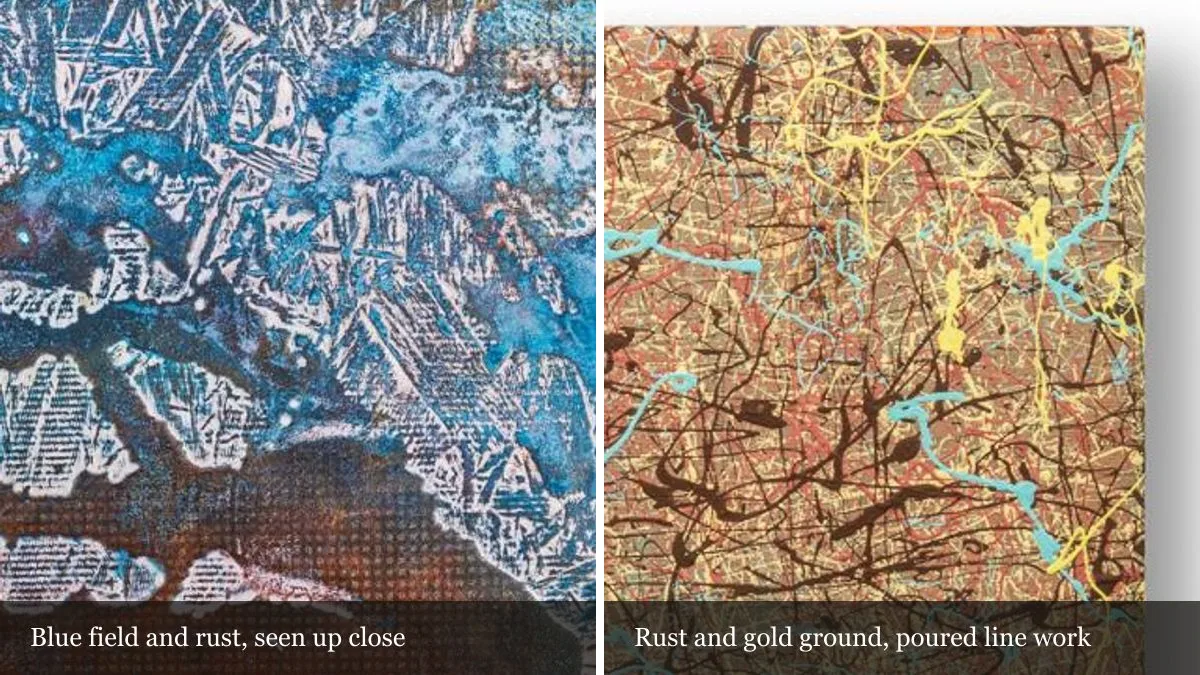
What blue, rust and gold each do to a wall
Each of the three behaves differently once it is hung. What follows is what we notice when a piece gets carried from one wall to another during a viewing.
- Blue puts distance in. A large blue field reads as depth rather than as surface, and the wall behind it seems to sit further back. In a small room that is a gain.
- Rust comes forward. Warm earth colours advance, so a rust-dominant piece pulls its wall towards you. That is what makes one work in a corridor or a narrow room.
- Gold carries the light. Ochre and cream pick up whatever light is nearest — a lamp, a window — so they shift through the day while the blue and the rust stay roughly where they are.
That last one is the practical reason to want a gold note somewhere in a piece. It gives the painting something to do in the evening that it was not doing in the morning.
The same three colours, two different results
Both of these works are available, both are by Sergei Troshin, and between them they separate proportion from scale and finish. Here is what actually differs.
| Hamsin (2022) | Autumn Hysteria | |
|---|---|---|
| Colour holding the field | Blue, edge to edge | Rust and ochre, edge to edge |
| Second colour | Rust, one central mass | Dark brown poured line work |
| Accent | White scraped marks | Turquoise and yellow flicks |
| Size | 24 × 24 in (61 × 61 cm) | 11 × 14 in (27.9 × 35.6 cm) |
| Materials | Blue natural dye, acrylic and resin on wooden board | Acrylic on canvas, no poured coat |
| Surface | Glossy, and it reflects the room back at you | Matte, and it holds its value from any angle |
| Year | 2022 | 2019 |
The size difference is doing as much work here as the colour. At 24 by 24 inches, Hamsin can be the only thing on a wall. At 11 by 14 inches, Autumn Hysteria is an intimate piece: it belongs on a shelf, in a narrow stretch of wall beside a door, or in a group of small works rather than alone across a room. A rust-dominant painting that size will warm a corner. It will not warm a room.
Light changes the colour more than the wall does
The finish decides how far a colour moves through the day. Hamsin is built with blue natural dye that sank into the wooden board, then sealed under poured resin. A resin coat deepens the colour underneath the way water darkens a stone, and it leaves a reflective face. So the blue reads dense and dark in low light, lifts under a lamp, and will hand you back a reflection of whatever window is opposite it.
Autumn Hysteria is acrylic on bare canvas with no poured coat. Tate’s glossary entry on acrylic paint explains the material; on a wall it means the rust stays the same rust from morning to night, and you can stand anywhere in the room without meeting a highlight.
Light is also the one thing that changes these colours permanently. Dyed passages are light-sensitive in the way any dye is, so steady indirect light keeps them true far longer than a sunlit wall does. The American Institute for Conservation publishes plain-language guidance on caring for artwork at home, and for both of these it comes to the same three things: no direct sun, stable humidity, nothing abrasive. We have written before about how a dyed surface differs from a painted one in natural dye versus paint on wood, and about the light a raised surface needs in where to hang a textured piece.
A note on the word gold
Gold here is a colour, not a metal. The ochre and cream running through Autumn Hysteria is paint: the material line on its page says acrylic on canvas, and that is all it is. This is worth knowing because it is checkable. Every artwork page on this site lists what the piece is made of, and when a work contains something like collage or diamond dust, the material line names it. If a colour looks metallic and the material line does not mention metal, then pigment is doing the work.
How to decide, standing in your own room
Look at the wall at the two times of day you are actually home, not at midday when everything looks fine. Note the largest colour areas and the direction the light comes from. Then ask which of the three you need: a cool field to push a wall back, a warm one to pull it in, or a small warm piece to finish a corner that already works.
Both pieces here can be viewed in person in Markham by appointment, and we are happy to talk through how a work will sit in your space. The rest of the catalogue is in the Artworks collection, and you can ask us about a specific piece or call +1 (416) 919-8331.