Hang an original where you pass it several times a day and you will notice this within a week: the same painting looks different at nine in the morning and at six in the evening. Colours that led earlier have stepped back. A surface that looked flat has picked up ridges. Nothing has happened to the paint.
Why does the same painting look different at 9am and 6pm?
Because you are not looking at the same light. Across a day the light in a room changes direction, changes colour, and changes from one source to several. A painting can only show you what the light gives it, so each of those three shifts hands you a slightly different picture of the same object.
Nine and six are just shorthand for early and late. What follows from it matters more: a painting has more than one state, and the one you met first is not the real one.
Three things change, and each does a different job
Direction, colour, and the number of sources. Direction decides how much of the surface texture you see. Colour decides which pigments look strongest. The number of sources decides whether the work carries one clean set of highlights or several competing ones. They move independently, which is why the change rarely feels like simple dimming.
Direction is the one most people underestimate, and it is settled by which wall you chose. When the sun is low — early and late — daylight enters close to horizontal: it meets the wall opposite the window nearly face-on, and travels sideways across the wall beside it. Two different jobs, same hour, same room.
| Where the piece hangs | Sun low (early and late) | Sun high (middle of the day) |
|---|---|---|
| Wall opposite the window | Light arrives close to face-on. A glossy surface returns an image of the window; relief flattens out. | Most light has bounced off ceiling and floor first. Even, soft, very little glare. |
| Wall beside the window | Light travels across the surface. Every raised strand lifts and drops its own shadow. | Far less directional. The relief settles and colour leads instead. |
| Wall with no daylight on it | The hour changes far less. Whatever your fittings do is mostly what the piece does, all day and all year. | |
Conservators put a number on the angle. The Canadian Conservation Institute's note on track lighting sets the target beam at 60° to the horizontal, specifically to avoid “glare, unwanted reflections, and undue emphasis of the surface features of the object” — and adds that angles greater than 60° “will accentuate surface detail and texture”. A gallery measures the throw to hold that angle steady; a window gives you a different one every hour. We wrote about picking the wall for a raised surface in where to hang a textured piece.
A sealed face and a bare one do not behave the same way
A poured resin or epoxy coat gives a work a hard, glossy face, and a glossy face returns an image of whatever is bright in front of it. Bare paint scatters light instead, so it does not hand the room back to you — but its colours travel much further when the colour of the light changes. Most of this catalogue sits in the first group: 36 of the 61 works name resin or epoxy in their materials line.
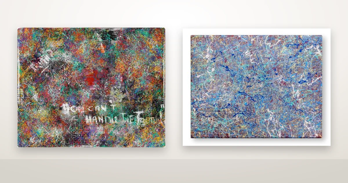
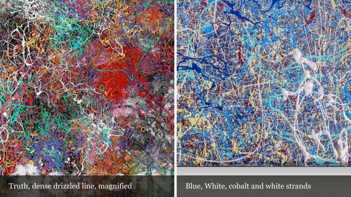
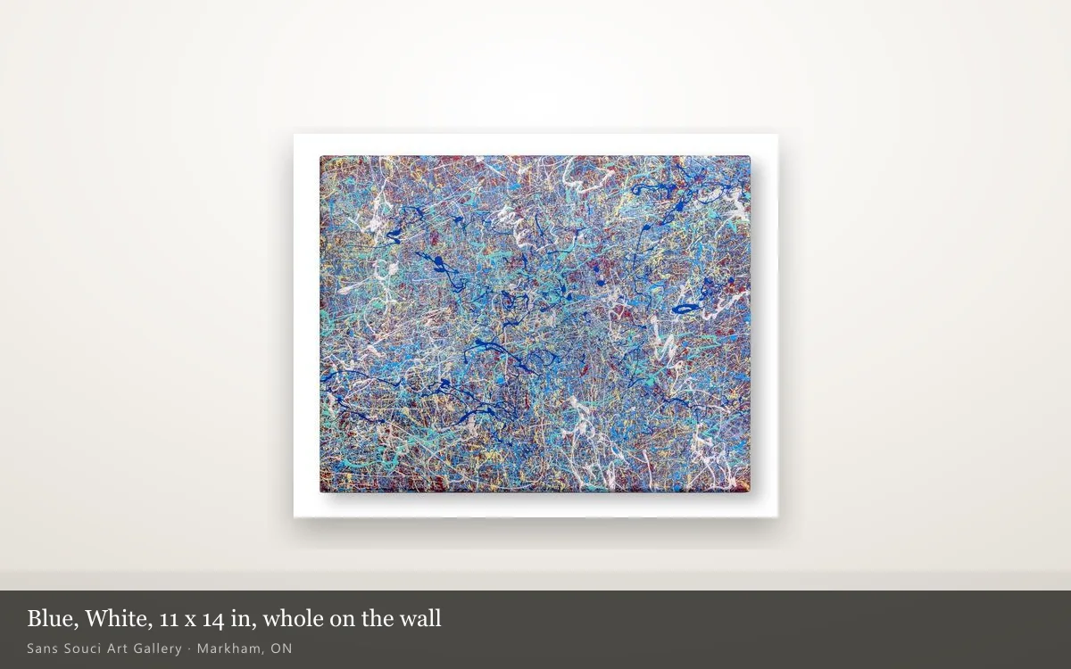
Two pieces show the split cleanly: same construction, different finish. Truth (2020, acrylic, hardboard and resin, 24 × 20 in) and Blue, White (2019, acrylic on canvas, 11 × 14 in) are both dense webs of drizzled line, laid strand over strand until the ground is nearly buried. Truth's page names resin among its materials. Blue, White's names no coat at all.
So they come unstuck at different moments. Truth carries the whole spectrum — reds, teals, oranges and white over a grey and black ground — so a shift in the source spreads thin across all of them. What Truth does instead is catch: at the hour when light arrives face-on, the resin hands you a bright rectangle of window on top of the painting, and the section underneath is not available until the sun moves.
Blue, White has the opposite problem and the opposite luxury. It does not glare back the way a poured face does, at any hour, from any wall. But its palette is narrow — cobalt, turquoise and white over a warm red-brown ground — and when one band of colour holds most of the field, a change in the source moves the whole picture at once.
| Truth | Blue, White | |
|---|---|---|
| Year | 2020 | 2019 |
| Materials, as the page states | Acrylic, hardboard, resin | Acrylic on canvas |
| Size | 24 × 20 in | 11 × 14 in |
| Face | Glossy, poured coat | Bare paint, no clear coat named |
| Palette | Full spectrum over grey and black | Blues and white over warm red-brown |
| What moves it most through a day | Where the light is | What colour the light is |
| Status | Available | Available |
By six in the evening you are often not looking at daylight at all
For several months of the Ontario year the sun is down well before six, so the evening version of a painting is a lamp version. That is the good news: unlike the sun, lamps are something you choose. Colour temperature is printed in kelvin on every bulb box, and the gap between the common options is wide.
CCI's guidance on light, ultraviolet and infrared lists the ranges: traditional incandescent around 2700–2800 K, “warm white” about 3000 K, “cool white” about 4200 K, and lamps sold as “daylight” between 5000 and 6500 K. The same document notes that a low colour temperature “sometimes provokes criticism in museums, especially for paintings created outdoors using blue colours”, and that moving from 2800 K up to 3000 K “eliminates most such criticism”. Two hundred kelvin is a small change on paper and a visible one on a blue painting.
Three things follow, and none of them costs anything:
- Match every bulb in the room. A ceiling fitting at 2700 K and a floor lamp at 4000 K means the piece changes as you cross the room, and you will blame the painting. Pick one number and buy the bulbs together.
- Warm light flatters warm work and drains cool work. Rust, gold and ochre gain under 2700 K. Blues and whites give up most of their separation. If the piece you want is built on blue, 3000 K or a little above is the kinder setting — which is exactly the correction CCI describes.
- Put the lamp off to one side, not in front. A fitting aimed straight at a resin face will be visible in it every evening, from the chair you sit in. The 60° rule applies to a living room as much as to a gallery.
What to check before you buy
The most useful thing is to see a piece at more than one hour — or at least to know what the other hours do to it. A short list:
- Say which wall it is going on, and where the window is. Opposite the window and beside the window are two different purchases, especially for anything with a poured coat.
- Ask whether the face is sealed. On this site it is in the materials line — resin, epoxy, varnish, or nothing at all. An unsealed surface behaves differently rather than worse. Our note on what a resin finish really does goes through it properly.
- Look at the depth of the surface, not only the image. Raised line and heavy texture are what the low sun finds; a flat surface changes far less through a day.
- Decide the bulbs before the work arrives, not after you have decided you dislike it in the evening.
One thing we should say plainly about our own catalogue. Every work in the artworks collection is photographed once, under one light, and that photograph is what you see on the listing, the card and the top of the page. It is honest, and still one state out of several — an even, flat-lit one, which is the version that shows the composition most clearly. The reflections, the raking light and the evening colour are left out on purpose.
None of this is a fault to be fixed. A painting that reads differently at nine and at six is giving you more than one thing for the same wall. It only becomes a problem when nobody mentions it and you meet the second version by surprise. If you want to know how a piece will behave at the hours you are actually home, ask — or come and stand in front of it. Viewings are by appointment in Markham, and we are glad to answer questions about a specific work.