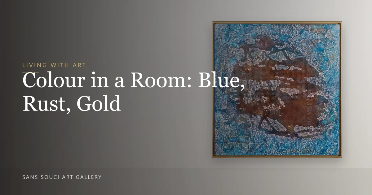
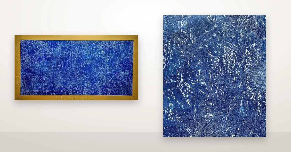
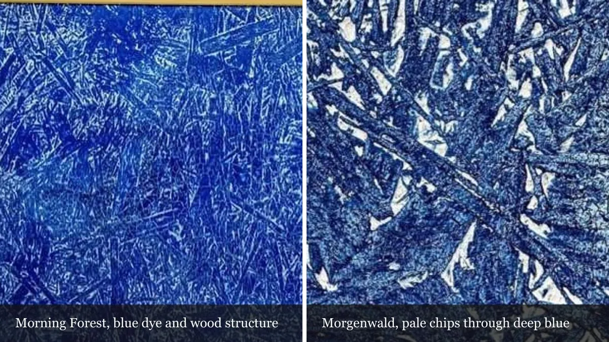
Most abstract paintings never tell you where their colour came from. Two works in this catalogue do. They are two versions of the same picture — Morgenwald in Meißen (2022) and Morning Forest in Meißen (2023) — and on both pages Sergei Troshin names his source in his own words: Meissen blue, the colour of the porcelain made in that Saxon town, and the forests he saw as a student travelling in eastern Germany.
Where does a palette come from?
From three places at once, usually: something the painter saw, something the material will do on its own, and whatever happened to be in the studio that week. Only the first of the three is ever written down, and most of the time not even that. Across the 61 works in this catalogue, 34 carry a description in the artist’s own words, and six of those name a real place.
The other 27 works carry no artist text at all. For those, what you have is the picture and the materials line, and that is the whole record. Nobody at this gallery can tell you what a colour in them refers to, because nothing was ever written down. So the pages that do name a source are worth reading slowly. Sometimes the question is the subject: 5 Shades Of Blue (2022) asks it outright on its own page — “How did the blue color get into the art world? Which Silk Roads? From what continents?”
What “Meissen blue” refers to
Meissen is a town near Dresden where the first European hard-paste porcelain was made, from 1710. Its blue-and-white ware is the colour the artist is pointing at, and both product pages tell the story behind it as he tells it: an alchemist ordered to produce gold, who produced porcelain instead.
The 2023 page tells it plainly. In the artist’s words: “During his pursuit of the Polish crown, he supported alchemists in the hope of finding a way to produce gold. Instead, Johann Friedrich Böttger developed the first European hard-paste porcelain, giving birth to the famous Meißen porcelain manufactory.” The 2022 page runs the same events as dialogue, with Augustus the Strong losing patience — “Bötger, do you want to live? Then don’t waste your time!”
The checkable version adds a name the painting’s telling leaves out. According to the encyclopaedia entry on Meissen porcelain, the early experiments were done in 1708 by Ehrenfried Walther von Tschirnhaus; after his death that October Böttger continued the work and brought the material to market, financed by Augustus the Strong, King of Poland and Elector of Saxony. Production at the royal factory started in 1710, and the crossed-swords mark followed in 1720. Two people, then, rather than one. It takes nothing away from the painting, and it is worth knowing before you repeat the story to a guest.
Why a Saxon forest is in a painting made in Ontario
Because the artist lived there. The about page records that his background is in German studies and linguistics, and the 2023 work’s own description fills in the rest: “During my years as a student at the University of Jena in Thuringia, I had the opportunity to travel through eastern Germany. Saxon Switzerland and Meißen left an unforgettable impression on me, like landscapes from a fairy tale.”
Saxon Switzerland is a real place and not a figure of speech. It is a sandstone landscape of table mountains, gorges and, as its national park puts it, species-rich forests, cut through by the Elbe valley; it is the only national park in Saxony. The source of these two paintings is therefore a memory of somewhere rather than a photograph of it, which is the honest way to describe what the artist says he was after — “to capture the spirit of this place through layered textures, natural dyes, and subtle touches of gold”.
How the blue was actually made
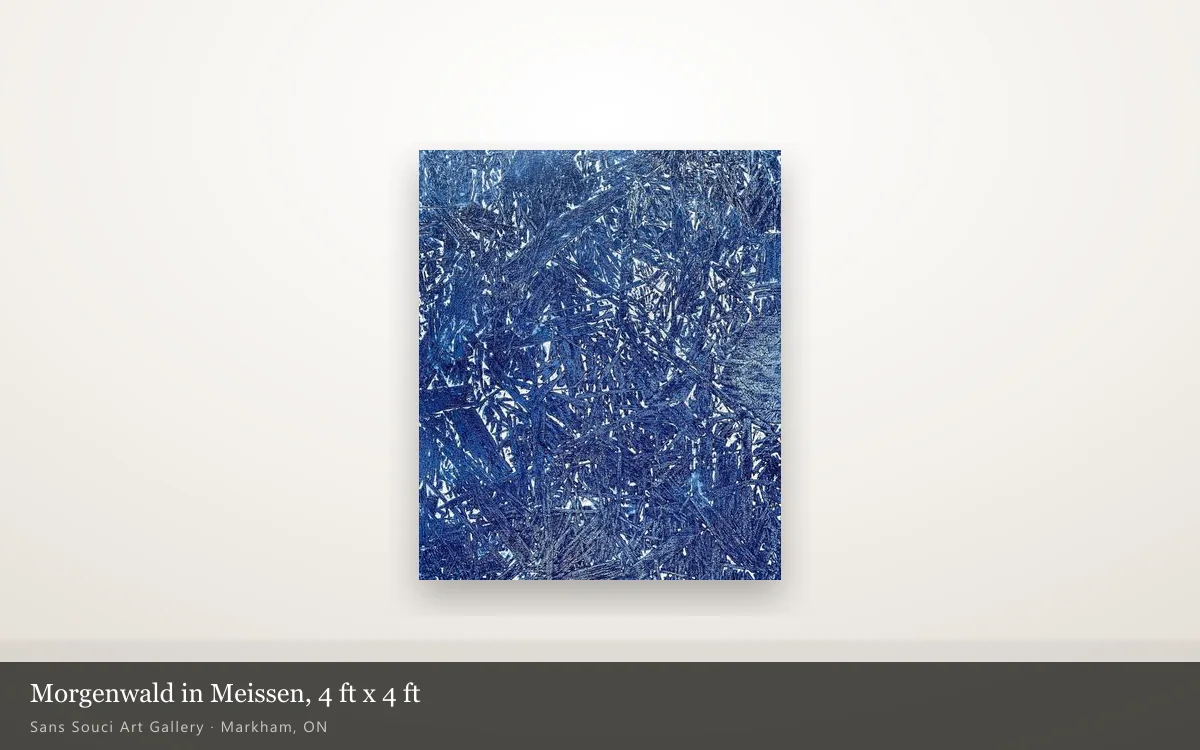
With a dye rather than with paint. The 2022 page says so directly: “The blue is made with a natural wood dye using a bizarre wood structure.” A dye soaks into the board instead of sitting on top of it, so the grain of the wood stays visible through the colour and ends up drawing part of the image. We wrote about that difference at length in natural dyes against paint on wood.
It is also the exception in this catalogue rather than the method. Of the 61 works, exactly three name a dye in their materials line: these two and Sunset at the Dead Sea (2022). All three are on wood. Fifty-six of the 61 name acrylic.
The 2022 description also accounts for the two other materials in the palette. Of the gold: “a touch of gold powder is visible here too, as a reminder of why it all started” — the gold being what Augustus sent the alchemist to find. And of the surface: “we will notice a slight crackle on the surface. This was necessary for binding my idea to the theme of antique porcelain.” Both are stated choices tied to the subject, which is rare enough here to be worth quoting rather than paraphrasing.
| Morgenwald in Meißen (2022) | Morning Forest in Meißen (2023) | |
|---|---|---|
| Materials, as the page lists them | Natural dye, acrylic, resin, mixed medium on wood | Acrylic, natural dyes, resin, wax paste, and diamond dust on wooden board (framed) |
| Size | 4 ft x 4 ft | 52 x 28 in |
| Framed | Not stated | Yes — the only one of the 61 whose materials line says so |
| Gold | Gold powder, named in the description | “Subtle touches of gold”, named in the description |
| What the description adds | The Böttger story as dialogue; how the blue was made; the crackle | The same history told plainly; the artist’s student years in Jena |
| Status | Available | Available |
What a dyed colour asks of you
More care about light than an acrylic surface does, as a class of material. The Canadian Conservation Institute sorts colourants into four light-sensitivity columns in its note on light, ultraviolet and infrared. Ceramic and true glass-enamel colours sit in the first one, headed “no sensitivity”: materials that do not change colour due to light.
Most plant extracts sit in the last column — “most historic bright dyes and lake pigments in all media: yellows, oranges, greens, purples, many reds, blues”, rated ISO Blue Wool #1, #2 or #3, which CCI defines as high sensitivity. The blue of the porcelain he is paying tribute to is, as a class of colour, about as permanent as colour gets; plant-derived dyes as a class sit at the far end of the same table. The institute keeps one exception in plain view: a few historic plant extracts, indigo on wool especially, are classed as low sensitivity. So “natural dye” on its own does not settle the question either way.
And it does not get settled here. We checked all 61 pages: the words cobalt, indigo, madder, ochre, lapis, ultramarine and pigment appear on none of them. The materials line says “natural dye” and stops. That is a gap in what we have written down rather than something withheld, so ask us before you commit a wall to one of these, and in the meantime treat it as the more sensitive case — no hours of direct sun. That is already what the care note on both pages says, and it is the same reasoning behind why a painting looks different at 9am and 6pm.
What to check before you choose one of these
- Which dye, and on what. The page says “natural dye” and no more. If the answer would change where you hang it, ask before you buy rather than after.
- Whether the colour has a stated source at all. Twenty-seven of the 61 works carry no artist text. For those, no origin exists on the record, and nobody should invent one for you.
- Which version you actually want. These are different objects: different sizes, different materials, one framed and one not. Both are available, and the 2023 page describes itself as another version of the 2022 one.
- Where the light falls. Both materials lines name resin, so the face is reflective, and the colour is dye-based. That is two separate reasons the wall matters more here than it does for an acrylic on canvas.
- How the name is spelled. The site writes the town the German way, Meißen, and both titles keep it. Meissen with a double s is the same place and the same blue. Other works built on wood are in the artworks listing.
Both Meißen works are available and both can be seen in person. The gallery is at 473 Simonston Blvd in Markham, open daily 9:00 to 18:00, with viewings by appointment — and a surface where the grain of the board draws part of the image is hard to read from a photograph. If you want to know more about either version, or you want the dye question answered before you decide, write to us.