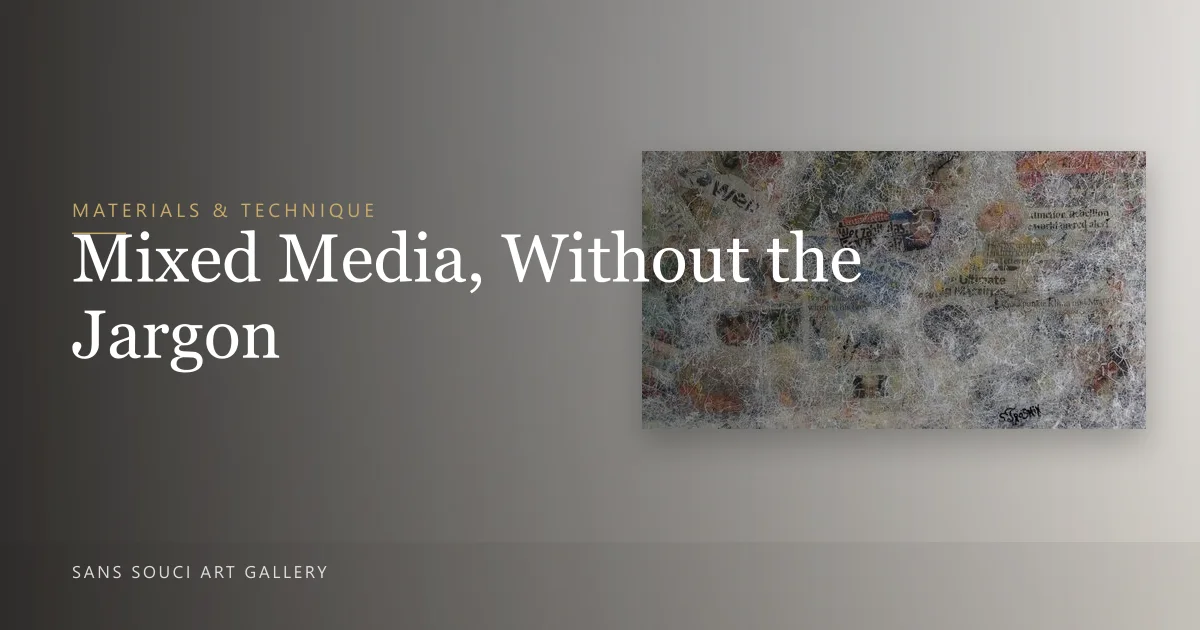
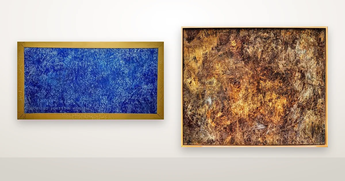
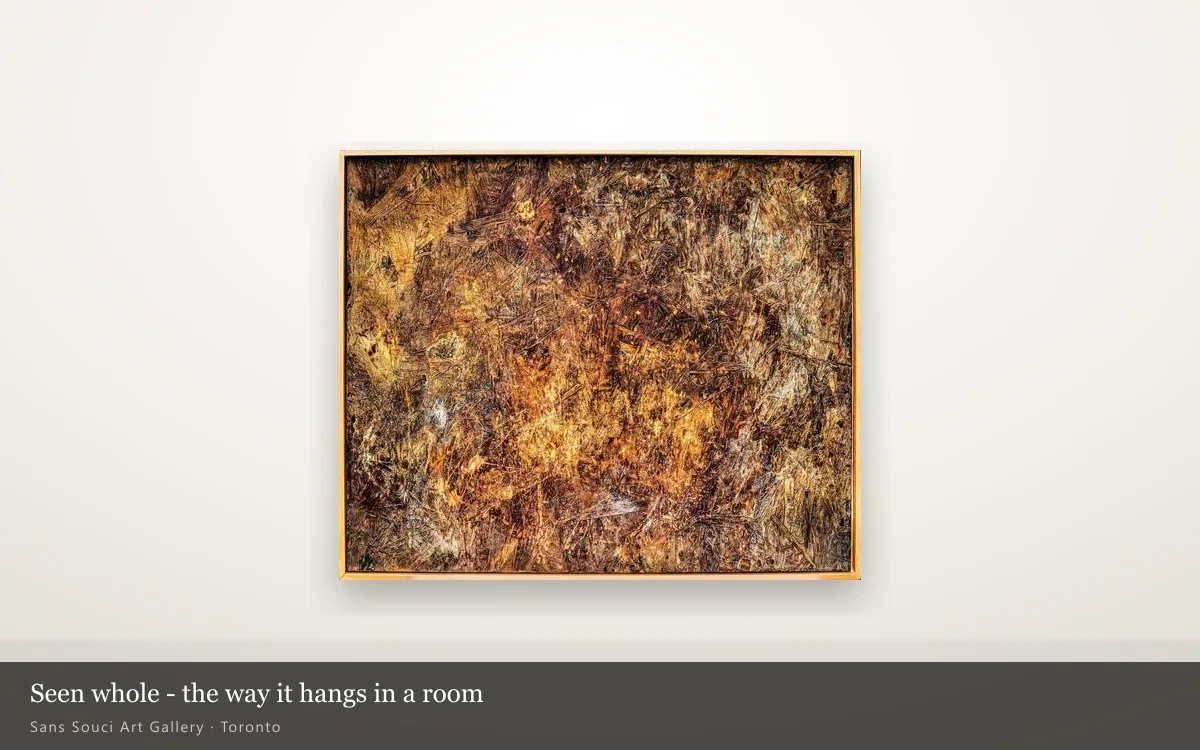
Stand close to one of these paintings and the first thing you notice is not the colour. It is that the surface is not flat. There are ridges you could catch a fingernail on, valleys where an earlier layer still shows through, and grit that throws back the light. Step back two metres and the same picture reads as a landscape, or a wall, or weather. That gap between what you see up close and what you see from across the room is the whole subject of this piece of writing.
What does texture actually do to a painting?
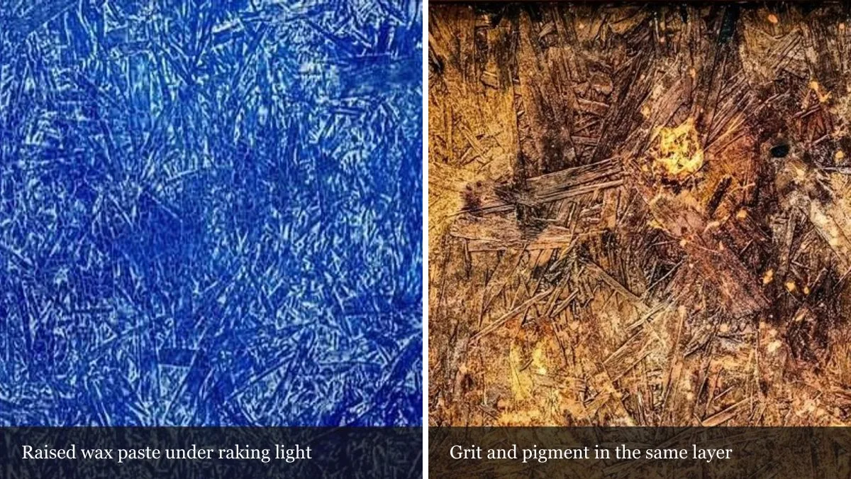
Texture turns a picture into an object that reacts to its surroundings. A flat print looks the same at nine in the morning and at six in the evening. A built-up surface does not: every ridge casts a small shadow, and as the light in your room moves, those shadows move with it. The painting appears to change without anything changing.
That is not a metaphor. It is simple physics, and it is the reason two people can look at the same work in the same week and describe two different pictures. It is also why texture is the hardest thing to sell online and the easiest thing to fall for in person.
Why do photographs lose it?
A camera flattens. It records one lighting condition, from one angle, at one moment, and then compresses the result into an image that is lit evenly on purpose. Everything that makes a raised surface interesting — the raking light, the small shadows, the way a metallic particle flares only from one position — is exactly what a clean product photograph is designed to remove.
You can see the problem on this site. Every artwork page carries a good photograph, and every one of them under-sells the surface. That is why the artwork pages have a magnifier: hover over a piece and you are looking at the original file at full resolution, which is the closest an image can get to standing in front of the work.
How texture is built here
The works in this gallery are not painted in one pass. Layers go down, get partly scraped back, and get covered again, so earlier decisions stay visible in the gaps. On top of that come materials chosen for how they behave rather than how they look in a tube:
- Natural dyes sink into wood unevenly and follow the grain, so the colour behaves like a stain rather than a coat of paint.
- Wax paste holds a physical shape — combed lines, ridges, the raised spiral that recurs across several works.
- Resin seals the surface and adds optical depth: light travels through it, hits the colour underneath, and comes back.
- Gold and diamond dust are scattered sparingly into the top layers. In flat light you may miss them entirely; move, and part of the surface lifts.
Of Morning Forest in Meißen, the artist writes that the deep blue is made with a natural wood dye over a bizarre wood structure, with a touch of gold powder and a deliberate crackle across the surface — the blue of Meissen porcelain, translated into a painted forest. It is a good example of texture doing narrative work rather than decorative work.
Reading a surface before you buy
You do not need training to judge a textured painting. You need a few minutes and the right questions.
| Look for | What it tells you |
|---|---|
| Shadows inside the surface | The relief is real, not printed or brushed to imitate depth. |
| Earlier layers visible in the gaps | The work was built over time; there is a history under the top layer. |
| How it changes as you move | Metallic or reflective material is present and will keep working in your room. |
| A sealed, even finish | Resin or varnish: easier to live with, easier to dust, more forgiving of daylight. |
| Edges and sides | Whether the piece is finished as an object, not just as a front face. |
On Whisper, the artist is direct about the choice of materials: “Wood, which remembers, and rust, which testifies to time.” The surface is the argument of the painting, not a finish applied to it afterwards.
What this means for the wall you have
Two practical consequences follow, and both are worth thinking about before you choose a piece rather than after.
First, light placement matters more than it does for a print. A textured work wants light arriving at an angle, not straight on. A wall that is bright but never in direct sun is close to ideal; light from a window to one side, or a lamp offset rather than centred, will show the relief instead of flattening it. Direct, sustained sunlight is the one thing genuinely worth avoiding.
Second, a busy wall fights the work. Heavily patterned wallpaper and a heavily built surface compete for the same attention, and both lose. These pieces are happiest with room around them.
Seeing it properly
Everything above is an argument for looking at a textured painting in person, in the light it will actually live in. You can browse the full catalogue of original artworks here, and read more about how Sergei Troshin builds these surfaces. If a particular piece holds your attention, tell us which one — viewings in the Greater Toronto Area are arranged by appointment, and photographs, however good, only ever tell part of the story.