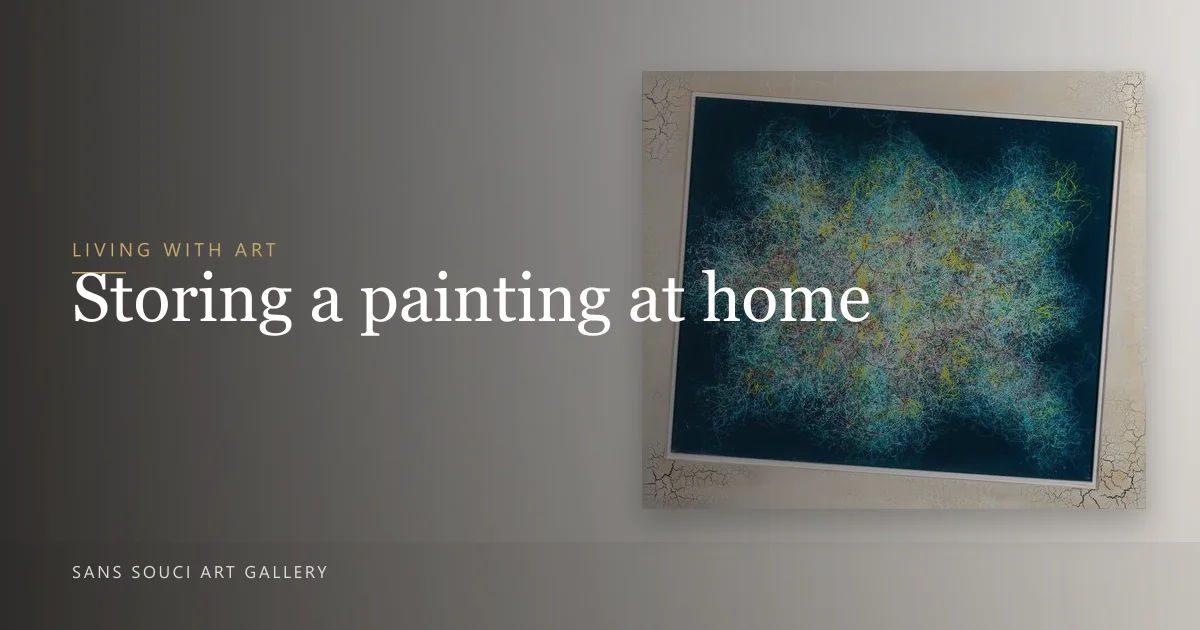
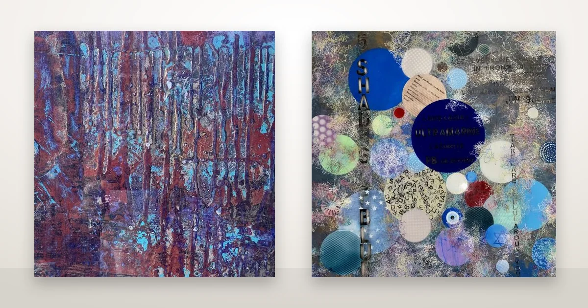
A textured painting looks different at ten in the morning than it does at six in the evening, and different again depending on how far it sits from the nearest window. Two pieces make the point well. Over The Horizon is a resin-sealed 24-by-24-inch panel built with raised, metallic texture. 5 Shades Of Blue is four feet square, with circles of collage — paper, thread, painted discs — sitting proud of a resin surface. Same gallery, same artist, and the hanging advice for each is not the same.
Does light matter more for a textured piece than a flat one?
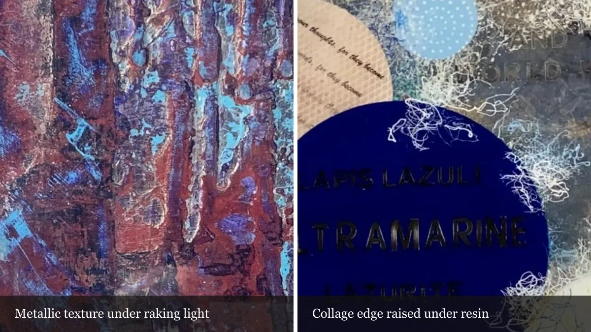
Yes. Texture only reads when light crosses the surface at an angle. Light that hits a panel head-on flattens every ridge and collage edge into a single flat colour; light that rakes across it from the side throws small shadows that show the actual relief. A textured piece hung under a centred ceiling pot light, dead flat to the beam, will look almost like a print. The same piece angled even slightly toward a side window, or lit from a picture lamp mounted above it, shows the paint as paint.
Tate's glossary on raised, textured paint (impasto) explains why this happens: the surface itself is casting shadow, not just carrying colour. That is also why direct, prolonged sun is the one thing to avoid — both Over The Horizon and 5 Shades Of Blue carry the same caution on their own pages: keep them out of long hours of direct sun, and skip a wall that gets full afternoon light. UV fades pigment and ages a clear resin coat over years; it has nothing to do with how good the texture looks under normal daylight or lamp light, which is a separate, welcome thing.
How high should the centre of the piece sit?
Most galleries and framers start with the centre of a piece at roughly eye level — commonly cited as 57 to 60 inches (145 to 152 cm) from the floor — then adjust for the size of the work and what sits underneath it. That number is a starting point, not a rule, and the two pieces here show why it has to flex.
Over The Horizon's own page describes it as a mid-scale piece: close to square, with enough presence to hold a section of wall on its own above a console, a desk or a bedside. At that scale the 57–60 inch centre line works almost everywhere, because the piece is small enough that the furniture below it barely changes the read. A narrow hallway, a landing at the top of a staircase, or the wall behind a reading chair all suit it — anywhere someone passes close enough to see the surface, not just the shape.
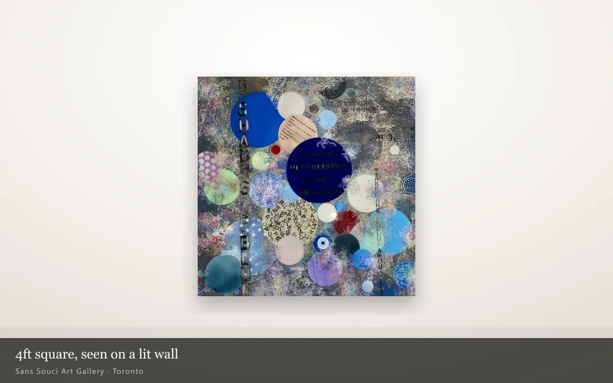
5 Shades Of Blue is a different problem. At four feet square (about 122 cm), the piece itself is nearly waist-to-eyebrow tall. Centre it at the standard eye-level height and the bottom edge lands close to a sofa back or a sideboard top — often too close for comfort, and too close for anyone to see the collage detail at the bottom without crouching. On a piece this size, we generally hang it a little lower than the textbook centre line and give it a wall with nothing else competing against it: a stairwell run, a dining wall, or the one wall in a room without windows, bookcases or a doorway breaking it up. It also needs viewing distance a small piece does not — stand close and the eye reads individual discs; stand back and the whole composition resolves into one blue field, which is really two different paintings depending on where you stand.
| Piece | Size | Support | Texture element | Best wall |
|---|---|---|---|---|
| Over The Horizon | 24 × 24 in (61 × 61 cm) | Hardboard, resin-sealed | Raised metallic texture across the whole face | Above a console, desk or bedside — needs a side lamp more than a big wall |
| 5 Shades Of Blue | 4 ft × 4 ft (~122 × 122 cm) | Plywood, collage, resin-sealed | Collage discs sitting proud of the surface | A single clear wall with room to step back and read the whole thing |
What about the wall you already have?
Start with which walls get direct sun and for how long. A north-facing wall, or one that only catches morning light, is the safer default for anything with a resin face — which covers most of what we sell, since a poured resin finish is common across the catalogue. A wall that floods with afternoon sun is the one to avoid for the piece itself, though it can still work if a curtain or blind controls the light for the hours that matter.
Next, handle the piece by its edges before it ever reaches the wall — with a piece like 5 Shades Of Blue, the collage elements sit proud of the surface, so a hand flat against the front can catch and lift a raised edge. And for texture generally, a wall with a lamp, sconce or track light that can be angled will always show a textured piece better than one lit only from directly overhead.
If you are not sure which wall you have works for a specific piece, that is exactly the kind of question worth asking before buying, not after. Every artwork here leaves with a Certificate of Authenticity, viewings are by appointment, and we are glad to talk through a photo of your actual wall. Send us a photo and ask, or browse the full collection of available originals to see what else is textured this way.